WordPress Gutenberg Editor Blocks Explained – Understanding The Types Of Blocks (Video 3)
WordPress Gutenberg Editor Blocks Explained – Understanding The Types Of Blocks For Beginners (Video 3)
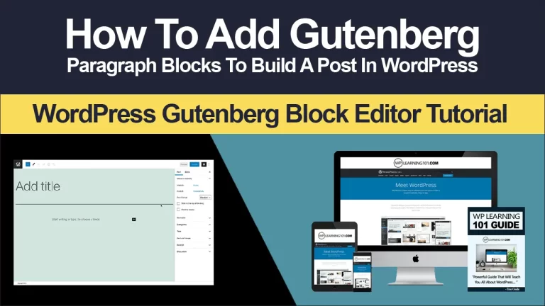
So we’ll cover all the sections, but we won’t actually go in depth as much as we will in the future videos all right. Okay. So if we return over here to access the blocks, you will need to simply click on the circle with the plus.
So click on here and you’ll see the most used blocks, so you can see they have paragraph, they have image, they have heading, they have gallery, they have lists, they have quote, they have file, they have cover and they have audio.
Now, these are just the most used, so a lot of these can actually be in some of these. Now, if you think about an editor and you think about the classic editor, there was only really so much that you could do so.
The reason why they switched over to Gutenberg is it really expands the ability to add more content, types, add more media types with ease of use, and that was really the whole goal. So sometimes you start out with Gutenberg.
It’s really frustrating, but I guarantee you if you finish it, you might really like it. So then we have common blocks. Then we have, as you can see here, uh a lot of them are actually similar to the most used blocks.
So these are common blocks. So you can see some media like audio video cover file gallery list and quote so a lot that we actually went over earlier and then, of course you got formatting blocks, you’ve got code, classic custom, html table pull quote pre-formatted verse and then of course, you have Layout elements, then you have buttons columns, media and text more page break separator and spacer.
So in other words, the layout elements allow you to move things around so that it looks better and we have widgets. We have the short code. We have archives. Calendar latest posts latest comments, categories, RSS, search and tag cloud and, of course we have embeds.
So this would be something that you would use, if you have say, for example, a YouTube video you could come here. You could click on the YouTube icon here and embed a video so same with these other ones.
You got embed, you have twitter, you have Facebook, you have Instagram, you can embed these, so this is great to have, especially as you’re, trying to build your social media and trying to get people to your social media properties.
So we’ve got Vimeo, which is a video hosting site kind of similar to YouTube. We have Animoto, which is a video creation site and we’ve got a lot of other sites as well, so we’re not going to dive too much into these, but these are more of the third party sites that you can use if you happen to have accounts for These, so if you have reddit, you have tumblr, you have amazon kindle you could post these widgets and embeds here, so we pretty much covered most of blocks now in terms of adding blocks all right.
So if we click here – and we can edit things here, if you put your mouse over the bottom or even the top, you will see an additional plus sign all right, so see that plus sign here. What that means is you can insert a block in between this block and this block.
So if you just want to continue adding blocks down below that’s great right, but if you’re thinking, oh, i missed a block. I wanted to add an image between this block and this block that allows you to do that.
So, if you think about the old classic editor, you would not really be able to do that as easily. You could go down and grab the content and then move it around, but it would end up really becoming tedious.
So the goal of this is to try and make your life a lot easier. Now there is a full screen mode if you click on the dot dot. Here you can click on full screen mode and that will basically expand it so that you can see the editor.
You don’t have to see the left sidebar or anything like that. So what we’re going to do is we are going to keep it like this, so that we don’t really have anything like distracting us all right. So as an example, if we click plus here and let’s say that we want a list, so we can put a list here, go one two, three four five and then we’re thinking.
Okay, I want to add an additional block. So I’m gonna click this here and I’ll add a quote. This is a quote now. Another thing to note is that if you want to move things around you’re going to see – and you put your mouse over the left hand, side you’re going to see these arrows.
So if you press these arrows, it will move it down. One block – or you can simply move this one down below this block, as you can see here now what this is this little six dots, it’s the same as these, except for it’s more of a kind of a drag friendly thing, so you can, as you can See here I can just drag things around, so it’s really not different.
It’s just the way that they’ve done. It is differently. Okay, so let’s say we want to add something else, so we’re gonna we’re gonna click here, so you can also click here. If you want to, but this option gives you the ability, click here and add a block, and if you click over here, you can add a blog as well so you’ll notice that it kind of gives you some flexibility on where you can click.
So i could click here and I could click. Let’s say we’ll, go to common blocks and we’ll choose, let’s say a gallery. So a gallery is basically a bunch of images that are showcased. So if you upload say 10 different videos, then you can organize them so that everyone can see them basically on a wall.
What’s nice about this is back in the day you could create galleries, but it’s a lot more simplified. So you can click, media library. You can choose the photos that you want and select them now, as you can see here, you can also transform these blocks into an image which is pretty cool.
So if you have a bunch of gallery images already but you’re thinking well, I want to switch this to just a single image. You can do that as well, so in certain respects you can even morph certain blocks into other blocks.
So another thing is, you can align, so you can align left, you can align center and you can align right now. If you click on these dot dot dot. This is basically more options. You can hide block settings which are, on the right hand, side.
So if I click that you can see that I’m able to see just the editor itself, so if that’s annoying me, I can literally remove that. But honestly it really depends on you. So if you click show block settings the right hand, sidebar will appear again.
Alright. So that’s a little little tweak now. If you want to duplicate something that you have created. Let’s say we have a gallery and we really like the gallery, but we want to add the gallery at the very bottom.
We can do that as well. So, to do that, you would simply click that block click on the more options and click on duplicate and, as you can see, it has made a duplicate of that block. So if you want to delete that you can click, remove block all right so again more options you can insert before or insert after what that means is, if you click it, you will insert a brand new block before or after so like you you’re.
Seeing here there’s a lot of options, you can either click here. You can either click here or you can simply click on the block and click on insert before you can also edit as html. So for those of you who are more advanced – and you don’t really like how things are laid out here – let’s say I want to go to the quote section, or maybe let’s do a paragraph.
So I’m going to add a paragraph up here. So, let’s add a paragraph: this is a paragraph and let’s say, for example, that i want to add like a JavaScript code or a html code, what you do is you click on that block click here, click edit as html, and you simply enter the html and Of course, when you’re done, you just click this and you click edit visually to go back to the visual editor.
So the visual editor is basically kind of a. What you see is what you get, and this is more so that you can see it. What it looks like to the end user and the html code is the code in the back all right, so you can add reusable blocks, so you basically can create blocks that can be reused again and again so think about these kind of, like templates.
So this could be like template one and you click save all right. So if you click plus here and you go down to reusable right here – you can see that template. One is here. So if we click on that you’re able to add that here so this is very very convenient, especially if you have certain elements that you like to repeat over and over and over again, and you want to go to a different post or different page and add That specific element to that page without having to redo everything right.
So that is very convenient. So that’s that we’re not really going to go in too much depth over here, because we’ll go in more depth in a minute in terms of the blocks and the the actual settings of the block.
Now, if you go over here, if you click on add image – or these are kind of like quick things and a lot of times, these here are elements that you have added in the past. So if you’re the person who adds a lot of images, you could click just here, click add image and there you go so you simply, you can either upload the image or you can click on media library or you can insert from a URL.
So if you have an image that is already hosted, you can simply enter the URL here. So what’s cool about Gutenberg is, as you can see, it gives you several different options. So there’s not really just one way of doing things.
There are actually several ways of doing things now from a newbie standpoint that might look complex because you might be thinking. Why is this here? Why is this here? Why is this here, but the reality is it’s trying to make things more convenient for you.
So let’s go further down and we’ll put this down here. We’ll click plus and the most used are not really the most used that other people use, but the most used that you use so that’s kind of nice because it really customizes the blocks for you.
So, as you begin to use it, it begins to get smarter and it knows what you’re doing, and it knows what you like to do. So if we scroll down further, these are the blocks here and we’ll go in more depth.
I’M going to go in depth on the common blocks, the formatting blocks and the layout elements like i said the widgets are a little bit more advanced, but short code is basically if you have a plug-in and they give you a short code and they say add The short code to your page, so if you were to do that, you click on short code and you would simply add the short code here now back in the day when you had the classic editor, you would have to go into the editor.
You would have to go into like either html view or sometimes view and add the short code there. So what this does? It allows you to kind of see this structure now, since we’ve added several blocks already.
If we go back to the top under block navigation, we can actually see how our blocks are set up. So you can see that at the top I’ve got heading. I’ve got quote: I’ve got two reusable blocks. I’ve got list, paragraph gallery image and short code.
Now, if i click on one of these, like let’s say I’ll click on list, it will go straight to that block. So as time goes on and you begin to add more blocks, because maybe your page is very very long and it has maybe 20 or 30 blocks – it’s gonna be a pain to actually have to scroll through it.
So that feature in itself is very convenient. As you can see here, so if I say okay, i just want to edit really quickly the image right here. It’ll go straight to the image, so that is really cool pro.
So a lot of pros here there are few cons, but a lot of pros in general, all right. So now that we’ve explained the blocks and the different categories of blocks and how you can apply the blocks to the editor and how you can move things around.
How you can make it look like the way you want to make it. Let’s move on to the next video.


![WordPress Gutenberg Editor Blocks Explained – Understanding The Types Of Blocks [Video 3 Of 9]](https://www.wplearning101.com/wp-content/uploads/2022/05/WordPress-Gutenberg-Editor-Blocks-Explained-–-Understanding-The-Types-Of-Blocks-Video-3-Of-9-683x1024.png)
![WordPress Classic Editor Explained [Video 8 Of 9]](https://www.wplearning101.com/wp-content/uploads/2022/05/WordPress-Classic-Editor-Explained-Video-8-Of-9-768x432.webp)
